Team
Product, Producer, Creative Director, Researcher, Designer, Copywriter, Developers, Legal
Role
Design Strategy, UX/UI Designer, Copywriter
Timeline
2 sprints
Tools
Figma, Figjam
The original ask
Citi's "apps with account access" page lets customers monitor applications that are connected to their bank accounts and allows them to revoke said access or grant access to additional accounts. Initially, product owners asked the design team for a quick solution that would improve the way the information was organized so that customers could easily see which apps they connected via Plaid, a third-party aggregation service.
Along with re-organizing the content, we also took this as an opportunity to implement styling and copy edits.
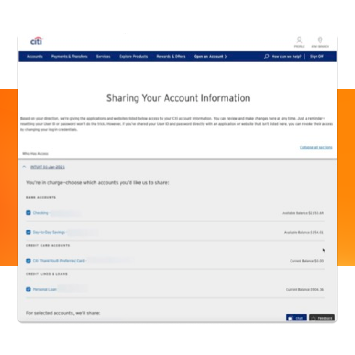
Legacy design
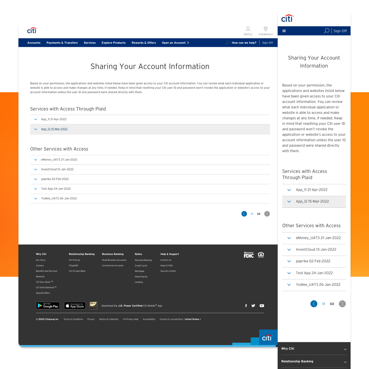
Initial updates, collapsed
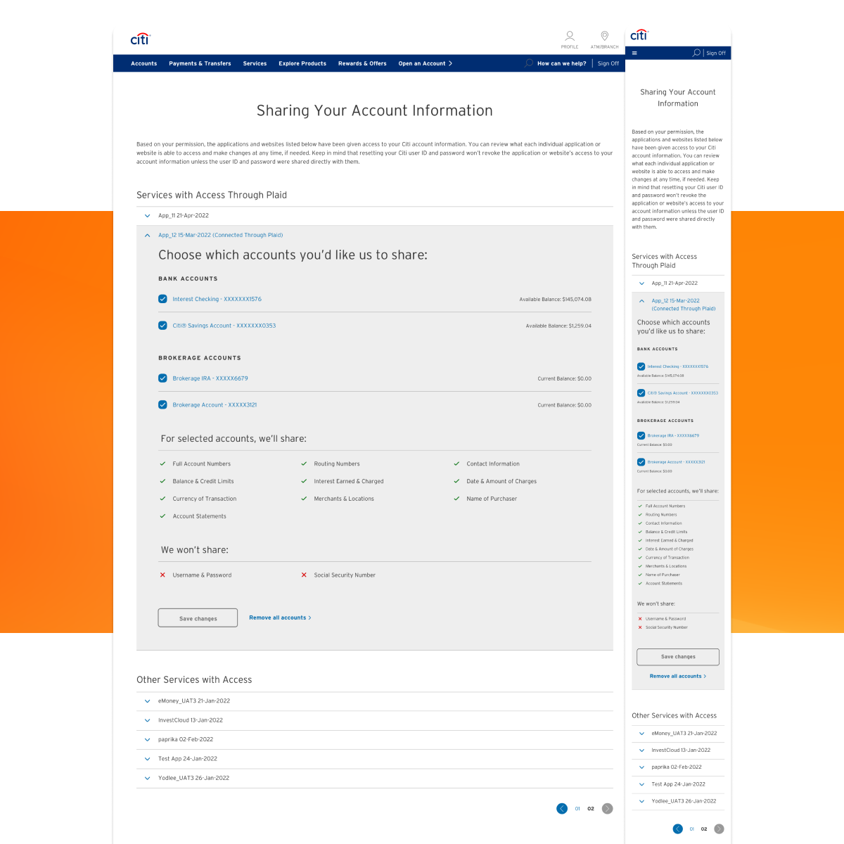
Initial updates, expanded
What we noticed
While working on the original request, we saw the opportunity to create an entirely new experience that would not only use Citi's latest design system components, but would also align with the on-going efforts to launch a hub for all device management tools.
To provide value for our proposal, and with the help of the research team, we surveyed customers on their experience with the legacy flow and found areas of opportunity.



What we wanted to solve
Although 61% of respondents were aware of the existing way to manage connected apps, the survey results showed only a 51% Promoter NPS score, with 35% Passive. And while those percentages were better than our competitors, we saw a clear opportunity to both increase page awareness as well as customer satisfaction with the product offering.
With buy-in from product owners, we decided to create an experience that would be easy to navigate, provided concise yet helpful information along the way and was consistent with other device management experiences Citi was developing. We started by re-mapping the customer journey for this flow.
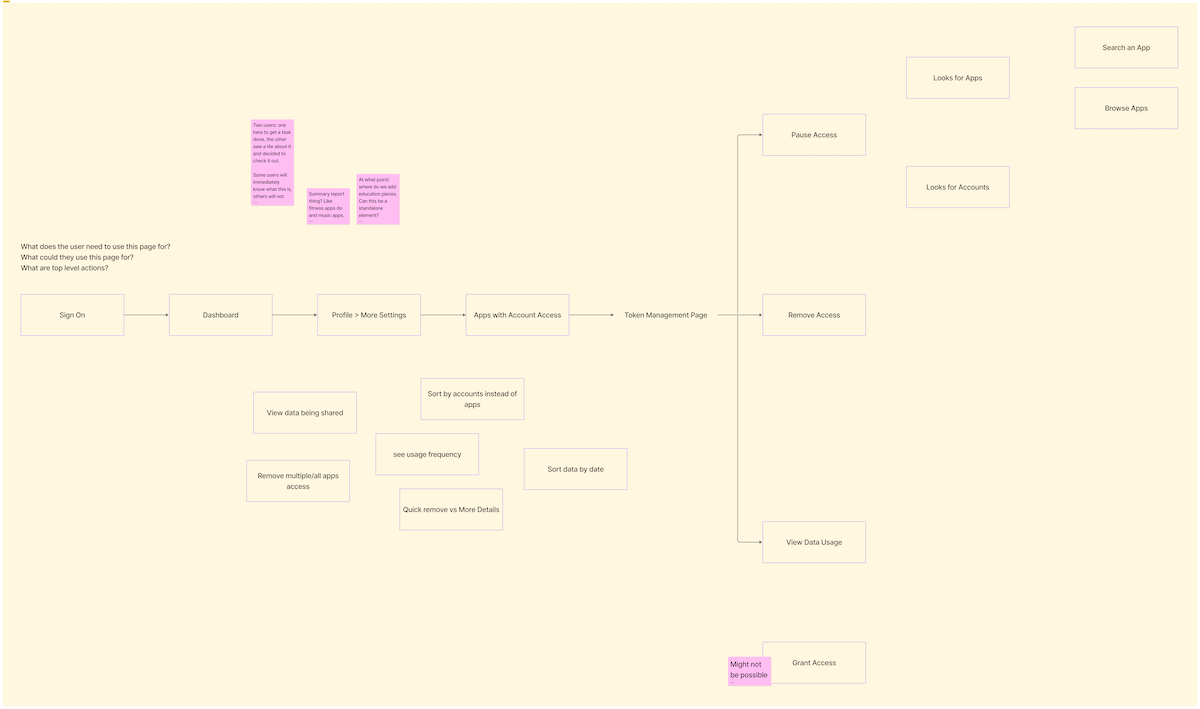
Initial customer journey idea
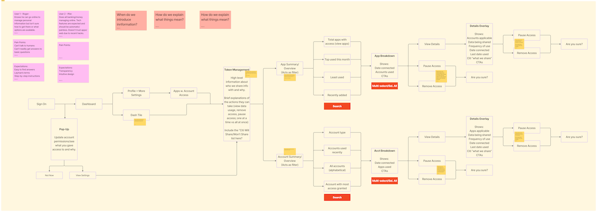
Final customer journey proposal
Our design approach
Design thinking began once the team aligned on a preferred customer journey. We collected examples from competitors and found other sources of inspiration, created wireframes and started to iterate lo-fi designs.
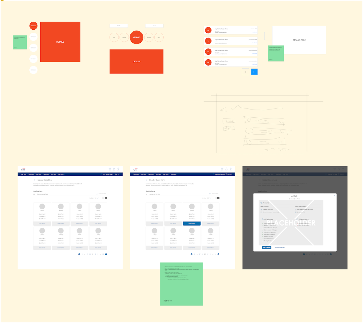
Wireframes

Initial ideas
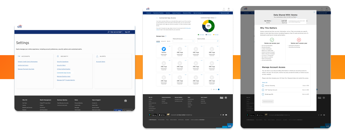
Keeping customer pain points in mind, we settled on a design that made it easy to manage connected apps, provided all relevant information in sophisticated manner and made it clearer as to what access was being granted or revoked. However, we decided to test two aspects of our proposal: how we should display definitions within the pop-up modal (tooltip vs footnote) and if we should change the name of the experience to "connected app access".
Test variation 1
Test variation 2
Our solution
From testing, we learned that "connected apps" was the name preferred by customers, as the word "access" made it seem like this tool would display hacking attempts or something similar. They also preferred to have definitions display in a tooltip and found the overall design of the modal to be intuitive and helpful.
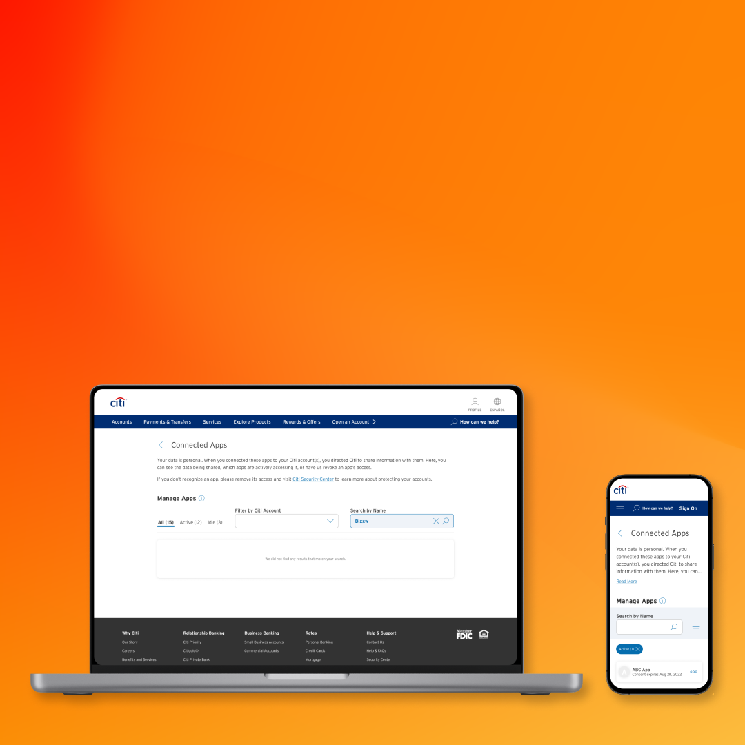
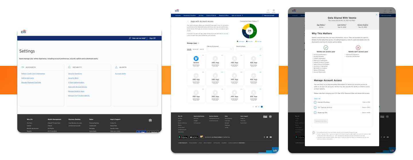
In the final iteration of the design, we also had to omit the pie chart and the "new" app status due to issues with development (even though customers found both to be useful during testing). Still, we delivered an experience that gives customers the ability to easily filter, sort and search through their connect apps, provides in-depth information about the data being shared and how they can manage an app's access to their accounts, and makes granting and revoking access simpler.
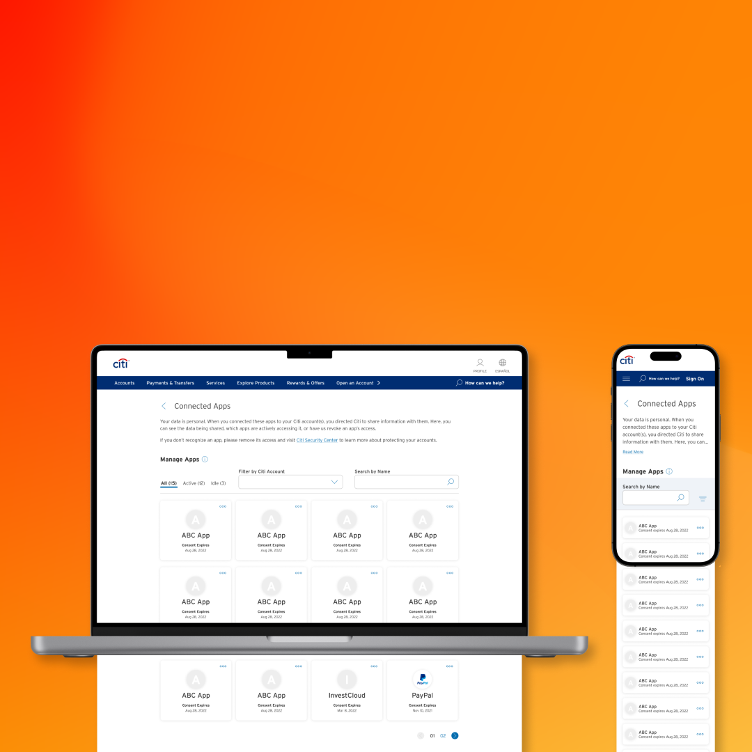
Initial view
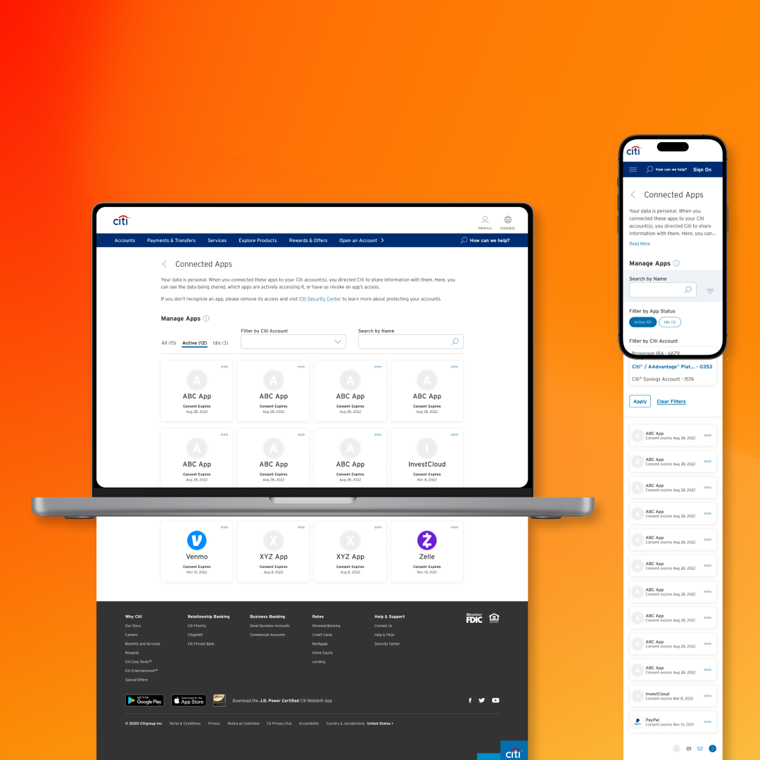
"Active" apps filtered
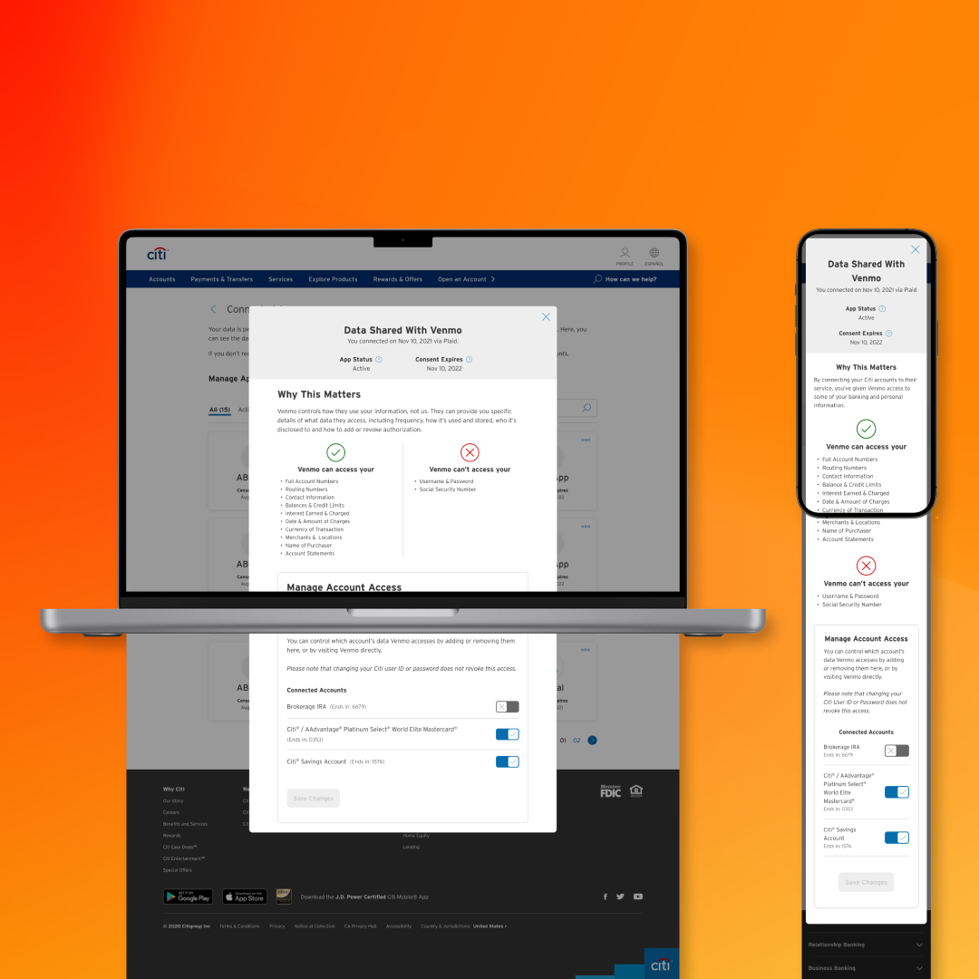
Pop-up modal
